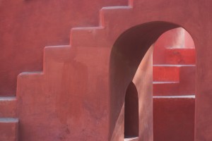
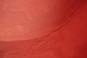
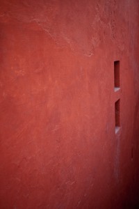
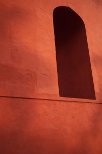
Composition can be made by the positioning of objects in the frame but also by shadows, colour changes and more...
Jantar Mantar
Compositional Project
Jantar mantar offered a fantastic opportunity to do a photographic study piece on composition. The reason it is such a good subject is that it is full of angles, shapes, and colours, with steps, recessions, and arches designed in classic eastern forms. The first consideration was to eliminate the background as much as possible. In order to focus on composition in an abstract sense you don’t want backgrounds, people or any other distractions.
Simplicity is the key. The images on this page have no distracting backgrounds, no environments in which to place them, they all stand on their own two feet so have to work purely on the expression of shapes, lines, colours and light.
Isolation of the subject matter means the viewer will concentrate on what you want them to concentrate on, and nothing else.
A main consideration was the light, as this project was photographed in January, the light was lower than in summer months, which really helps. Planning the time of day and the season, can heavily affect the results you get. Also finding the correct camera position, angle of view really makes a difference. You have to work the scene, and especially work the light. Even from the start of the shoot to the end of the shoot the light was changing, in intensity, position and nature. As clouds appeared it created a soft-box effect, as they went away the light became more direct & sharpened up the shadows, you need to be constantly aware of this.
In selecting compositions one is continuously asking the question, how balanced do I make this?
Balance is the key to composition.
The more balanced the more natural the composition looks the less balanced the more dynamic it can look, but if you go too far it doesn’t look right. Try to take several versions, see what works, decide later how risky you want to be with your final choice. Neither is right or wrong, your decisions will appeal to different audiences. Considerations of the compositions can come from many perspectives, its not just object positioning that creates composition, all the following can affect, enhance or detract from your compositions; shadows, colour changes, highlights, and focus. Here both simple & complex compositions were created, some based around colour tones and how they change, others considering the framing and in particular the light drop-off, where the light & colour saturation starts in the frame and how fast the colour fades to black or deep tones.
The way the eye travels across an image is driven by the compositional elements within the image, the lines and paths that components of the image take, form its structure. Think about leading lines, diagonals, and what is happening in the corners of the image, these elements create flow and dynamism. We can then experiment with differing levels of each component to create the balance we want.
The image on the left is non-conventional with the windows sitting far to the right, way off the conventional rule of thirds. But it works as the windows are “highlights” of darkness which draw the eye, balanced by the larger space of solid but paler wall on the left.
How can highlights be of darkness? Well, its about photographic mass, the windows are dark and therefore have a mass, a weight to them, aesthetically speaking, this holds the eye, and is balanced by a larger mass of mid-toned red/orange.
The image on the right is very dynamic in terms of composition, it has lines that are not perpendicular to the framing of the image, the arch sits in an unconventional position, and the colour tones change across the image in an asymmetrical way. But this composition creates tension, and emotion.


